


Nineteen Eighty-Four by George Orwell
This tale of one man's struggle against totalitarianism has been appropriated the world over. ...more info on wikipedia
About the artist: Erik Montovanofrom the United States
Erik Montovano is a creative director and the founder of the multi award design company Newspeak. He is a graduate of The School of Visual Arts in New York City. His work has been recognized by the The New York Festival, American Institute of Graphic Arts, the Broadcast Design Association, The Type Directors Club, and Graphis Magazine. His work has been featured in national and international creative publications and his short film, Attack of the Angry Cloud, was selected for showing at the International Festival of Movement on Screen; the music video, Everything Becomes Whole, he directed for Sarah Fimm has been selected for showing at the 12th Woodstock Film Festival.
Why this work
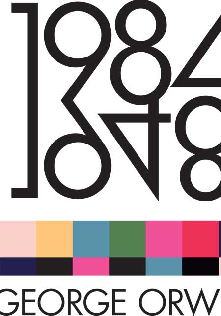
I chose Orwell’s 1984 because the ideas and the process of thinking reflected in the book are a big part of my creative inspiration. Whenever I re-read the book it sparks new ideas. In addition as an extension of that thought when I first created my design studio 7 years I named the studio after the artificial official language in the book, Newspeak. Design is a language that can be used for different purposes, yet, the motivation of design, especially when used in the media, is ambiguous. The ambiguity is not unilateral, the word Newspeak serves to remind our studio about a designer’s social responsibility towards his/her audience. On his design he sais: “Orwell finished writing the book in 1948 and reversed the last two digits to form the title Nineteen Eighty Four. The typography layout of the 1984/1948 is a reflection of that. The colour bars under the title make reference to broadcast colour bars; the colours have been stylized to suggest a sombre tone, which hints at Orwell’s anti-Utopian view of the world in the future. The main graphic is meant to draw the viewer in to hypnotize, similarly on how the tele-screens do to the Oceanian residents. The graphic element in the poster hints to an eye, the eye has a slight imperfection. The fractional imperfection stands as a graphical representation of Orwell’s anti-Utopian view of the world in the future; i.e. Orwell’s view that the current imperfections of the world will slowly and dramatically worsen.”