


Nostromo by Joseph Conrad
Conrad's masterpiece: a tale of money, love and revolutionary politics. ...more info on wikipedia
About the artist: Studio DelReyfrom Brasil
Delfin is a Brazilian graphic designer, working hard since 1992. His Studio DelRey has worked for some of the best publishing houses in Brazil. Last year, he was finalist of Jabuti, the most prestigious prize of the book market at the country. Few months ago, he was one of the two winners of the Getty Prize for Best Book Cover of the Year. His radio show, Owl’s Nest (Ninho do Coruja in Portuguese), airs live since 2002, every Sunday. He’s also a journalist, writer and, in some Saturday nights, he picks his vinyls and plays it, for anyone who wants to hear, in his birthplace, Campinas, near São Paulo.
Why this work
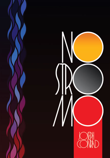
“The original idea involved a silhouette of Nostromo, the seaman, and the colours of fictitious Costaguana. And it was fine. But it was only figurative, and I was trying to put a résumé of the book on the image.”
“Then I saw the “O”s in the title of the book, remembered the original 1904 cover and the idea came: I decided to create a font that valorizes the “O”s, to use them to spot main contents of the book. Specifically three: the main character, Mr. Gould; the Silver everyone wanted; and the blood that remains after the conflicts.
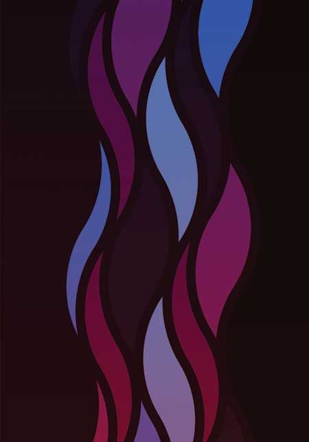
The design per se is clean. Basically typographic, with synthetic representations of the three elements (gold, silver and blood), together with the water (representing the seabord of the original subtitle, “a tale of the seabord”) and the fire, representing the increasing revolution involved in the plot.